Title sequence for a channel 4 programme on the NHS and the public's trust in it. The programme was called The Trust and the video can be viewed on WNA website by clicking
HERE.


Maholy Nagy explains: This piece of lighting equipment is a device used for demonstrating both plays of light and manifestations of movement. The model consists of a cube-like body or box, 120 x 120 cm in size, with a circular opening (stage opening) at its front side. On the back of the panel, mounted around the opening are a number of yellow, green, blue, red, and white-toned electric bulbs (approximately 70 illuminating bulbs of 15 watts each, and 5 headlamps of 100 watts). Located inside the body, parallel to its front side, is a second panel; this panel too, bears a circular opening about which are mounted electric lightbulbs of different colors. In accordance with a predetermined plan, individual bulbs glow at different points. They illuminate a continually moving mechanism built of partly translucent, partly transparent, and partly fretted materials, in order to cause the best possible play of shadow formations on the back wall of the closed box. (When the demonstration occurs in a darkened space, the back wall of the box can be removed and the color and shadow projection shown on a screen of any chosen size behind the box.) The mechanism is supported by a circular platform on which a three-part mechanism is built. The dividing walls are made of transparent cellophane, and a metal wall made of vertical rods. Each of the three sectors of the framework accommodate a different, playful movement study, which individually goes into effect when it appears on the main disc revolving before the stage opening.


Andrew Byrom

Jo Ratcliffe


Andrew Byrom
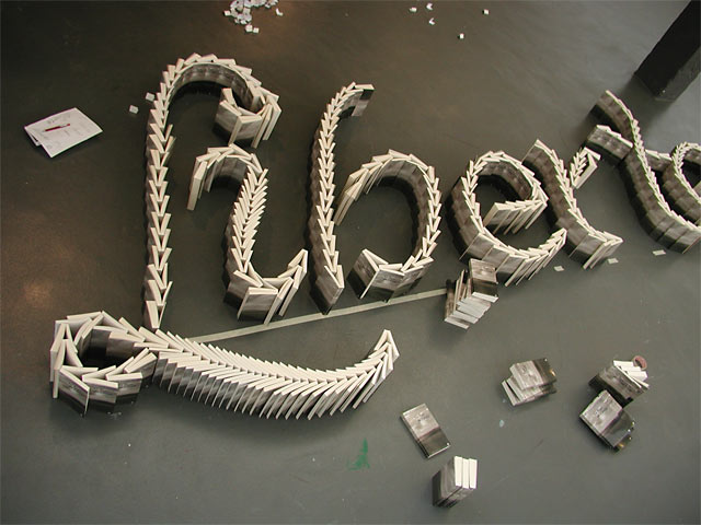
 Type Workshop

Kokokumara


Type Workshop, organised by Dutch design studio Underware


Stefan Sagmeister


Experimental Jetset
Above are the songs by 2-step/ dubstep artist Burial that i have used as the main focus of this project. The comments that people have left under these songs I will analyse and take as inspiration for my typographic shrine. Many of his songs feature his unique sound of broken beats and ethereal vocal samples and are very similar in character and to these songs, but I mainly focussed on the comments left under these songs because i feel their are his most poignant and therefore more likely to encourage profound comments by the Youtube users.
The artist himself has always had a lot of mystery surrounding him after releases two albums without ever having made a public appearance or gig and not releasing any photo of himself even on the internet. Lead to much speculation and hype in underground music circles and web forums.
The film above is by Why Not Associates called The Trust. It was designed as a title sequence for a channel 4 documentary about a nhs hospital trust.


 Type Workshop


