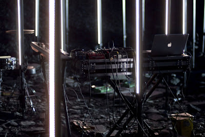
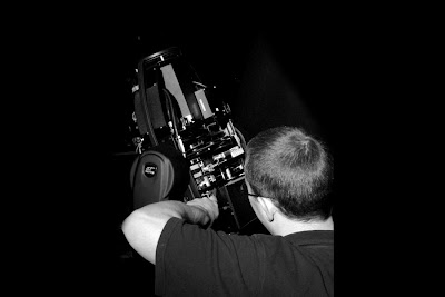
 I came across this on 'The Strange Attractor' blog. I like the almost monotone image combined with the one other bright colour, yellow highlighting the shiny bright brass. I also like the fact that the button are slightly misaligned. I don't like the red at the bottom of the image. I feel it ruins an otherwise interesting image.
Saturday, April 24, 2010
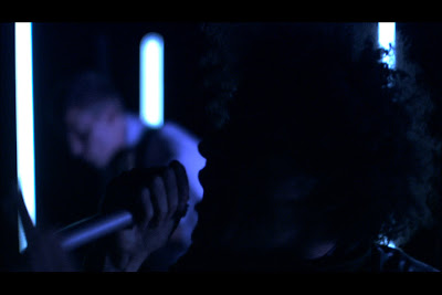
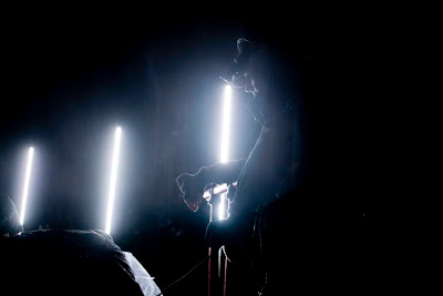
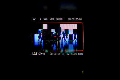
Demetrius May: Buffalo
 I came across this on 'The Strange Attractor' blog. I like the almost monotone image combined with the one other bright colour, yellow highlighting the shiny bright brass. I also like the fact that the button are slightly misaligned. I don't like the red at the bottom of the image. I feel it ruins an otherwise interesting image.
Monday, April 19, 2010
Sunday, April 18, 2010
Symphonie Diagnole by Viking Eggeling
Wednesday, March 24, 2010
Tuesday, March 9, 2010
Wednesday, March 3, 2010
Diana Photos


Tuesday, March 2, 2010
Sunday, February 28, 2010
Documenting the making of a project
Wednesday, February 24, 2010
ABECEDA TYPOGRAPHY BOOK BY KAREL TEIGE
Teige and the other members of Devetsil would have certainly liked the ulterior declination of Abeceda built by Larsen. The Turinian group, active for more than ten years (a passage documented by six albums, the last and most recent being Seies), that communicate an eclectic and multi-disciplined approach to musical material. Specimen, in that sense, the work done years ago by Winsor McKay with his cartoons, put to music by Larsen under the wording of Cartoanimalettimatti (a project premiered in 2002 during the festival Rimusicazioni) and in general the stateless attitude with which the quartet measures the codes of rock, after the zeroing of the same rock provoked by punk, as such to make Larsen more appreciated abroad than in their own country. Reasons for which the artistic interlocutors of the Turinian group tend to place themselves beyond borders. American are both the labels - Young God and Important Records -- that have released their music so far, and many of their partners seen often by their side, Jamie Stewart (Xiu Xiu) - in the configuration called XXL, or Matmos and the ex-Swans Michael Gira and Jarboe. All icons of the independent music scene across the ocean.
Some of these accomplices will play with Larsen on Abeceda : David Tibet, brain of the british "apocalyptic" project Current 93, project that also involves Baby Dee, transgender cult icon from the Manhattan off scene, same underground the cello player Julia Kent, of Antony and The Johnsons, belongs to, whereas Johann Johannsson, musician and producer that has worked with Marc Almond and Barry Adamson, comes from Island. Also on stage with the band will be the russian performer and choreographer Snejanka Mihaylova; together with Larsen, and the visuals by the Bellissimo team inspired by Tiege's Abeceda, they will set up a concert/performance in 25 movements, one for each letter of the latin alphabet; elaborate and fascinating staging, exclusive worldwide preview for the Torino Settembre Musica festival and its audience.
We Are Thoughtful: Tate campaign


Tuesday, February 23, 2010
Carry A Poem: an Edinburgh based project


Monday, February 15, 2010
Yellow Arrow Projects
The project is built around the general philosophy that every place is distinct and engaging if seen from a unique perspective. With this foundation, Yellow Arrow enables every place to become an attraction. Stories are always tied to unique details such as back-alley murals or unique street markers, as well as classic locations like the Empire State Building in New York or the Reichstag in Berlin. Overall, the aim is for Yellow Arrow to provide a frame and platform to see the world in a new way.
When the project was first introduced in 2004, renowned Stanford archaeologist and cultural theorist Michael Shanks wrote that Yellow Arrow was an example of "deep mapping cultural experience - a cartography of the intimate, the everyday, the monumental, the ephemeral, the epochal."
HOW IT WORKS
Participants place uniquely-coded Yellow Arrow stickers to draw attention to different locations and objects - a favorite view of the city, an odd fire hydrant, the local bar. By sending an SMS from a mobile phone to the Yellow Arrow number beginning with the arrow's unique code, Yellow Arrow authors connect a story to the location where they place their sticker. Messages range from short poetic fragments to personal stories to game-like prompts to action. When another person encounters the Yellow Arrow, he or she sends its code to the Yellow Arrow number and immediately receives the message on their mobile phone. The website yellowarrow.net extends this location-based exchange, by allowing participants to annotate their arrows with photos and maps in the online gallery of Yellow Arrows placed throughout the world.
With mobile technology we are now able to integrate the social potential of networked experience with the immediacy and relevance of the physical world. As Jean Baudrillard writes in response to student strikes in France of May 1968:
"The real revolutionary media were the walls and their speech, the silk-screen posters and the handpainted notices, the street where speech began and was exchanged - everything that was an immediate inscription, given and turned, spoken and answered, mobile in the same space and time, reciprocal and antagonistic. The street is, in this sense, the alternative and subversive form of the mass media, since it isn't, like the latter, an objectified support for answerless messages, a transmission system at a distance. It is the frayed space of the symbolic exchange of speech - ephemeral, mortal."
In a networked age, different communities across the globe have very different access to technology, but mobile phones have become widely available across all social classes. By perceiving a network as something that is inherently a combination of physical, social, and technological components, the project hopes to bring these elements together under a paradigm that honors the type of vibrant exchange Baudrillard found so inspiring.
Greyworld: artwork in public spaces

Trace is a permanent sound installation for the historic maze at Hampton Court Palace. As visitors pass through the maze they trigger a series of sounds that capture the intrigue and mystery of the maze's rich heritage.


Visitors to the installation space are requested to think of a word. Any word at all. They are handed a white cube, which they hold. As they speak their word in to the box, the box begins to glow with a gentle blue light.
They are then invited to explore what appears to be a large empty space, delineated by a red line around its edges. As they wander off in to this area they realise that in fact, invisible to the eye, there is a rich sonic environment to explore, full of words that are nestling amongst trees, flitting around pools of water, or hiding out in caves.
Some of these words live here permanently, and some have been dropped by people walking through the space. If the visitor wants to do this, they simply tip over their box, the light drains away, and their word falls out, living in that area for several hours, for others to discover.. When they are done, they return the box, to be filled by another word.
Wednesday, February 10, 2010
Sunday, February 7, 2010
Cascade on Wheels

We made two different visualizations of the same data set. We intended not just to visualize the data in a readable way, but also to express its meaning, with the use of metaphors. In the Walls Map piece, car counts are represented by 3D vertical columns emerging from the streets map, like walls. The Traffic Mixer piece, where noise is the metaphor, is an hybrid of a visualization and a sound toy. The first piece focuses more on showing the data in a readable and functional way, while the latter focuses more on expressing the meaning of the data and immersing the user into these numbers. Both pieces try to complete each other.
Cascade on Wheels: Traffic Mixer from steph thirion on Vimeo.
- SOFTWARE USED
- Both pieces were built in Processing. The Walls Map makes use of the geomerative and OCD libraries. The Traffic Mixer uses the minim library.
- Data scrapping and handling was done in Ruby, with a blend of builder, hpricot and rexml.
- The editor to draw the polygons on the map and link them with the data set was built in Macromedia Flash.
'The Clock Clock' by Humans Since 1982


that show the time in a digital manner. They also developed a typefont on this basis.
'The Clock Clock' will be shown at rhosska design museum in gothenburg from
june to mid august 2009.
Wednesday, February 3, 2010
Links
Tuesday, February 2, 2010
Mapping Movement


Monday, February 1, 2010
Social Constellation: online community application


"I am looking at how the feeling of loneliness or the disconnection between social groups in a city could be relieved if only slightly by an online community visualisation that presents no information about any of its users.
When something universally humorous happens in a public space, it momentarily changes your relationship to strangers around you, relieving the feeling of disconnection if only for a moment. However, your anonymity remains intact.
I am focussing on the romance tied up within the idea of particular cities and how this visualisation could utilise that romantic value in order to relieve disconnection. London is an ideal example of a city with a high romantic value to utilise.
Despite being surrounded by isolated examples of a busy city as we walk down the street or travel in a bus, we are never able to visualise it in its entirety. We certainly experience the feeling less when sitting in an office all day.
The image above left is a still moment from a hacked version of an ecosystem application by Annie Spinster. I have been looking at how physical inputs can be incorporated into such an application using for example the light sensors in the user's Mac Book Pro which may isolate a particular type of user within the community.
The image above right is an early IP address mapping ecosystem that I was concepting with W Blutt. Here, the ecosystem substrate is the IP address activity, the mapped location of each dot is based upon the four sets of numbers present in an IP address. The growth of the ecosystem is dependent on the quantity of IP addresses which would act as substrate at the bottom level of growth. Therefore, parameters control the extent, but the ecosystem itself is organic which creates the interest, in a similar way to looking into a fish tank".
James Thompson
Blogging with bar graphs
Limited Edition Poster
A series of daily blog posts that explored the visual language of self–documentation. It was part of a larger project about the contrast between individual and group intentions on the internet and the rise of both the monologue and the conversation in the form of blogs and group applications respectively.
It was also an attempt to reduce my textual output into the blogosphere. The system for deciding the theme of the blog was such that I could decide at a whim in the same way that any blog author would.

24 hours of colour: A photograph taken every nine minutes
throughout my day
05.04.09
The day I noticed that I often take the colours of my surroundings for granted during the winter months as the daylight is often grey and muted. I visually documented the colours of my day by taking a photograph every nine minutes of what I considered to represent the average colour of my surroundings. I obtained an average colour for each photograph by rescaling it to 1 pixel in width.
The following list documents the reasons for the changes in the
colour of my surroundings on a sunday in April:
01. Battle with the snooze button.
02. Reply to email. Preparatory work for photoshoot. Procrastinate on Facebook.
03. Wait outside to be picked up with equipment. Text ex–girlfriend to arrange when I can pick up belongings.
04. Drive to Pitfield street. Receive angry text from ex–girlfriend.
Continue my conversation with the driver as if I had not.
05. Walk to red brick tenament blocks on Arnold Circus.
06. Reach location. Begin to set up.
07. Catch bus to ex–girlfriend’s house. She is not in.
08. Continue the shoot behind Columbia road flower market.
09. Lunch in cafe close to Arnold Circus.
10. Walk back to car on Pitfield street.
11. Catch bus back to Camberwell.
12. Work at the flat in natural light.
13. Realise it has suddenly become dark and turn on light. Wonder if many other people find themselves accidentally working all seven days of the week. Quickly realise that the
answer to this is yes. Continue working.
Generative Typography


